


Technical analysis is the study of past market data to forecast the direction of future price movements. The method is considered a subset of security analysis in addition to fundamental analysis. Here we look at how to use technical analysis in day trading.
It is often contrasted with fundamental analysis, which can be applied both at the macroeconomic and microeconomic levels. Fundamental analysis at the micro level includes research on revenue, expenses, income, assets and liabilities, capital structure and soft factors (quality of management team, position of competitive position).

Macro-level fundamental analysis entails studying or forecasting economic growth, inflation, credit cycles, interest rate trends, capital flows between countries, labor and resource utilization, and cyclicality. , demographic trends, political policy and behavior, central banks, consumer and business trends, and soft data (e.g. sentiment or confidence surveys).
Some traders may specialize in one or the other while some will use both methods to inform their trading and investment decisions.
Most major banks and brokerages have teams that specialize in fundamental and technical analysis. In general, the more quality information there is to improve the right rate, the better one’s trading results.
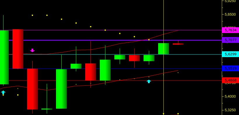
Technical analysts are often referred to as chartists, which reflect the use of charts that display price and volume data to identify trends and patterns for stock analysis. Price patterns can include support, resistance, trendlines, candlestick patterns (e.g. head and shoulders, reversals), moving averages, and technical indicators.
Assumptions in technical analysis
While some traders and investors use both fundamental and technical analysis, most tend to fall into one camp or the other or at least rely on one of the much heavier trading decisions. .
Technical analysts rely on the methodology due to two main beliefs – (1) price history tends to follow cycles and (2) price, volume, and volatility tend to follow other trends. separate.
Let’s go through each one individually:
Market cycle
Such is human nature, with commonly shared behavioral traits, market history tends to repeat itself. The sequence of events is not perfectly repeatable, but the patterns are generally similar. This can take the form of long-term or short-term price action.
In the long run, business cycles are inherently prone to repeating themselves, due to credit booms where debt rises unsustainably above earnings for a while and eventually leads to financial pain when there is not enough money. available to service these debts. This tends to lead to slow increases in stocks and other risky trades on risk (e.g. trading execution ) during expansions and sharp declines during downturns.
Technologists implicitly believe that market participants have a tendency to repeat past behavior due to its collective, stereotypical nature. If the behavior is indeed repeatable, this implies that it can be recognized by looking at past price and volume data and used to predict future price patterns. If traders can identify opportunities where the behavior is likely to be repeated, they can identify trades where the risk/reward is in their favor.
Therefore, there is a presumption in technical analysis that the price of the market drops all the information affecting a particular market. Although fundamental events impact financial markets, such as news and economic data, if this information is already reflected or immediate in the asset’s price upon release, technical analysis instead That would focus on determining price trends and the degree to which market participants value certain information.
For example, if U.S. CPI inflation data is up one-tenth of the market price before the news release, we can get an idea of how sensitive the market is to that information by Watch the asset price react immediately afterwards.
If US stock futures fall by X%, the US dollar index increase by Y%, and the yield on 10-year US Treasuries increases by Z%, we can perceive such economic inputs to affect a certain markets. Knowing these sensitivities can be valuable for stress testing purposes as a form of risk management. For example, if inflation spikes by 1%, we can use data points related to unexpected inflation readings to determine how a portfolio might be affected.
Price, volume and volatility follow distinct trends
Another assumption behind technical analysis (and all broader stock analysis) is that prices do not move in a random walk, or in a clear logical pattern. Instead, it moves in trends that are both explainable and predictable.
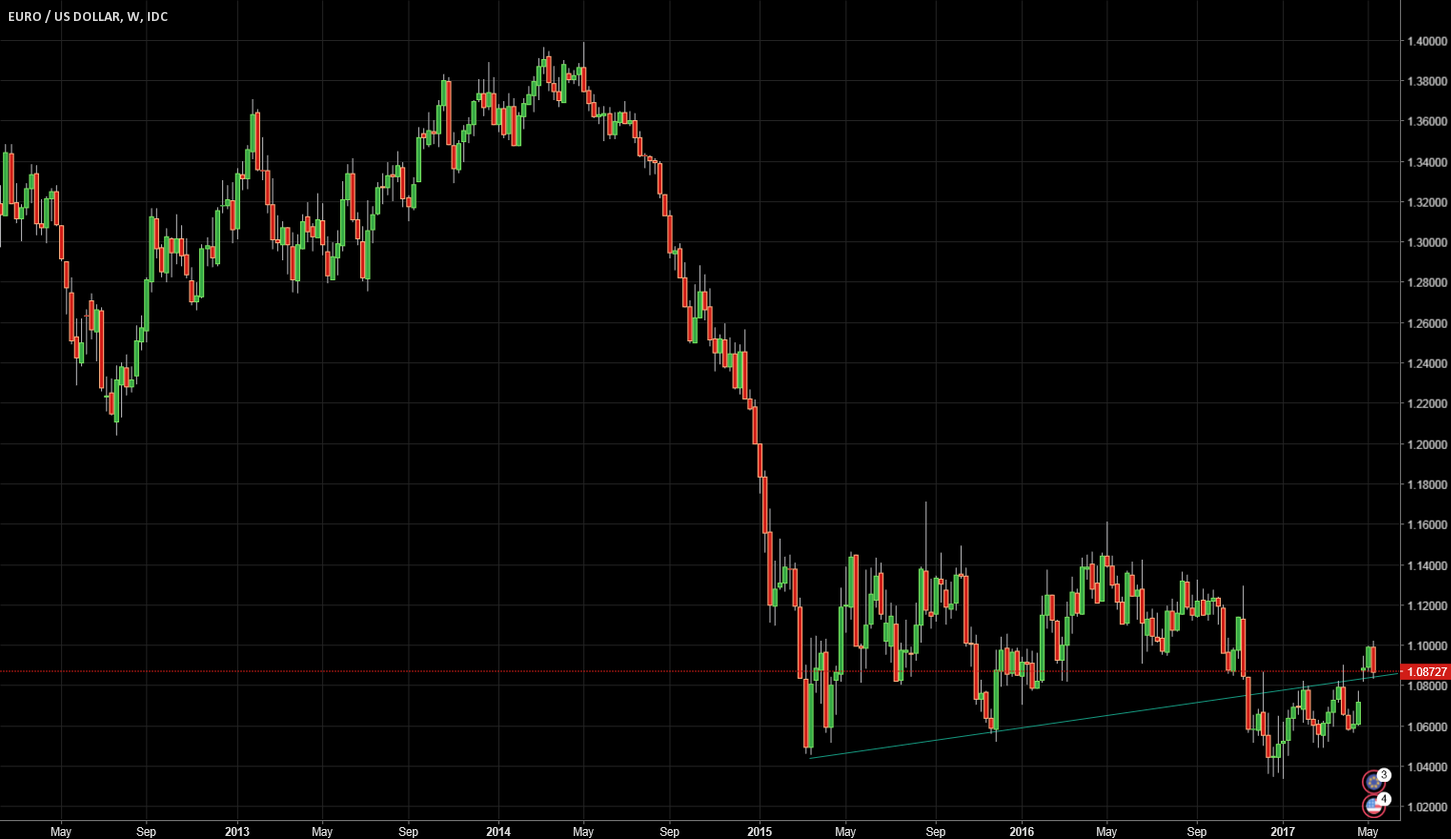
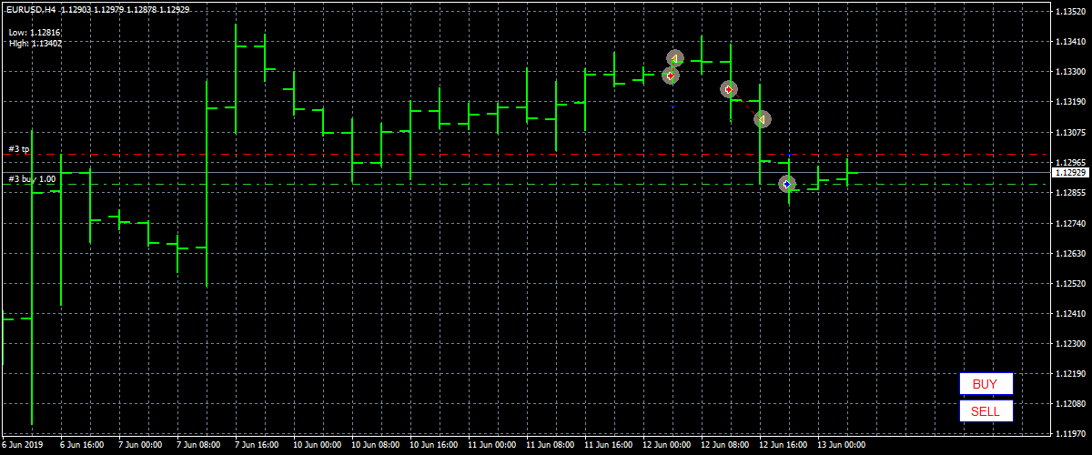
For example, if we look at the EUR/USD chart from mid-2013 to mid-2017, we can see how technical analysis plays a role by looking at support and resistance in the context of trends. direction. After the euro started to depreciate against the US dollar due to the divergence in monetary policy in mid-2014, technical analysts may have taken short trades above the drop to the resistance level. in the context of a downtrend (marked with arrows in the image below). After the trend has faded and the market has started to consolidate, a technician may have chosen to play range and start taking a long time of support while closing any pre-existing short positions.
Characteristics
In the beginning, technical analysis was largely a matter of reading the tape or interpreting the successive flow and magnitude of price and volume data through a security. As computers became more common in the 1970s, data was aggregated into a graph and became the technician’s standard reference point.
Recognize chart patterns and bar (or later candlestick) analysis as the most common forms of analysis, followed by regression analysis, moving averages, and price correlation. Today, the number of technical indicators is numerous. Anyone with coding knowledge related to a software program can convert price or volume data into a specific indicator of interest.
While technical analysis alone cannot fully or accurately predict the future, it is useful for identifying trends, behavioral information, and potential mismatches in supply and demand where trading opportunities exist. pandemic.
Analytical methods
There are several ways to approach technical analysis. The simplest method is through a basic candlestick price chart, which displays price history and the buying and selling dynamics of prices over a specified period.
(S&P 500 Weekly Candlestick Price Chart) Others use price charts in conjunction with technical indicators or use specialized forms of technical analysis, such as Elliott or Wave theory comedy, to generate commercial ideas. Some use parts of several different methods. At the same time, traders must resist the idea of information overload and cluttered charts with so many indicators and lines that it starts to adversely affect one’s ability to read charts.
Traders can make a subjective assessment of their trading calls, avoiding having to trade on a rules-based approach that is limited due to the uniqueness of each situation.
Others can only enter a trade when certain rules are in place to improve the objectivity of their trading and avoid emotional biases that affect its performance.
Types of charts
Candlesticks
Candlestick charts are the most common form of charting in software today. Green (or sometimes white) is often used to describe bullish candlesticks, where the current price is higher than the opening price. Red (or sometimes black) is common for bearish candles, where the current price is lower than the opening price.
It shows the distance between the open and close (the real body) and the total daily range (the wick top to the wick bottom).
(Candles show up and down movement in the S&P 500 index)
Open High-Low-Close
Candlestick charts are similar to high open low close chart, also known as bar chart. But instead of the real body showing the difference between the open and close prices, these levels are represented by horizontal ticks. The ticker price opens the point on the left (to show that it comes from the past) while the other tick price is on the right.
Row
Line charts connect data points using a line, usually from the closing price of each time period.
Area
An area chart is essentially the same as a line chart, with the area below it being shaded. This is mainly done to make it easier to visualize price movement than a line chart.
Heiken-Ashi
The Heiken-Ashi chart uses candlesticks as a graphing medium, but has a different mathematical formula for price. Instead of the standard process of candles being translated from the basic high and low opening and closing criteria, the price is smoothed to better represent trending price action according to this formula:
- Open = (Open previous bar + Close previous bar) / 2
- Close = (Open + High + Low + Close) / 4
- High = Highest High, Open or Close
- Low = Low Low, Open or Close
General Terms
Average True Range – Range over a certain period of time, usually daily.
Breakout – When price breaches an area of support or resistance, it is usually due to a noticeable increase in buying or selling volume.
Cycles – Periods where price action is expected to follow a certain pattern.
Dead Cats Bounce – When prices drop in a bear market, there can be a rally in which buyers believe the property is cheap or oversold. However, when sellers forced the market to fall further, the temporary buy spell known as a dead cat bounced.
Dow Theory- Studying the relationship between the Dow Jones Industrial Average (an index comprising 30 US multinational corporations) and the Dow Jones Transportation Average. Proponents of the theory say that once one of them tends in a certain direction, the other is likely to follow. Many traders follow the transportation sector for it can shed some insight into the health of the economy. A large volume of shipments and transactions is a sign that the economy is moving in the right direction. A similar indicator is the Baltic dryness index.
Doji – A type of candle characterized by little or no change between the opening and closing prices, indicating indecision in the market.
Elliott Wave Theory – Wave Theory Elliott suggests that the market runs through periods of predictable cyclical optimism and pessimism and is therefore ripe for trading opportunities.
Fibonacci Ratios – Numbers are used as a guide to identify support and resistance.
Harmony – Trading harmony is based on the idea that price patterns repeat themselves and turning points in the market can be identified through Fibonacci sequences.
Momentum – Rate of price change over time.
Price Action – The movement of price, as represented graphically through the chart of a particular market.
Resistance – A price level where the priority of sell orders can be placed, causing the price to bounce off the decline. Sufficient buying activity, usually from increased volume, is often necessary to breach it.
Retracement – A reversal in the direction of the prevailing trend, expected to be temporary, usually at a support or resistance level.
Support – A price level where a larger degree of orders can be placed, causing the price to bounce off the upside. The level will not hold if there is enough selling activity to outperform buying activity.
Trend – Price movement that lasts in one direction for an extended period of time.
Technical analysis indicators
Technical indicators involve some statistical or metric transformation of price and/or volume data to provide mathematical descriptions of up/down movement, support and resistance levels, and momentum. , trend, deviation from central trend, ratio, correlation, among other delimiters. Some indicators also depict sentiment, such as short interest, implied volatility, put/call ratio, fear and greed, etc.
Technical indicators fall into a few main categories, including price-based, volume-based, width-based, overlay, and non-chart-based.
Based on price
Average Directional Index (ADX) – Measures trend strength on an absolute value basis.
Average Directional Movement Rating (ADXR) – Measures the rate of change in a trend.
Commodity Channel Index (CCI) – Identify new trends or cyclical conditions.
Coppock Curve – Momentum indicator, originally intended to identify bottoms in stock indices as part of a long-term trading strategy.
MACD – Plot the relationship between two separate moving averages; designed as a momentum indicator.
Momentum – Rate of price change over time.
Moving Averages – Average Price weighted to show trends across a range of values.
Relative Strength Index (RSI) – A 0-100 normalized momentum oscillator designed to determine the rate of change over a specified period of time.
Stochastic Oscillator – Displays the current price of the security or indicator against the high and low from a user defined range. Used to identify overbought and oversold conditions.
Trix – Combination to show trend and momentum.
Based on volume
Cash Flow Index – Measures the flow of money in and out of a stock over a specified period of time.
Negative Block Index – Designed to understand when “smart money” is active, under the assumption that smart money is most active on low volume days and inactive on high volume days. The indicator focuses on the daily level when the volume decreases from the previous day.
Equilibrium Volume – Use volume to predict further changes in price. Proponents of the index place faith in the idea that if volume changes with a weak reaction in stocks, a price move is likely to occur.
Positive Volume Index – Often used in conjunction with a negative volume index, the indicator is designed to show when institutional investors are most active under the premise that they are most likely to buy or sell when low volume. Focus on days when the volume is up compared to the previous day.
Williams Accumulation/Distribution- Look at the difference between a security (or index) price and volume flow. This is designed to determine when a trader is accumulating (buying) or distributing (selling). For example, when the price makes a new low and the indicator fails to make a new low, this can be taken as a sign that accumulation (buying) is happening.
Width
The breadth indicator determines how strong or shallow the market moves are.
Advance-Decline Line – Measures the number of stocks that increase (increase in value) in an index compared to the number of stocks that fall (loss of value). If an index has increased in value but only 30% of stocks are up but 70% are down or neutral, that is a sign that buying is most likely happening only in certain sectors rather than positive for the entire market.
If 98% of stocks are up but only 2% are down or neutral at the market open, it is a sign that the market may be trending and reversing with a meaningful day trading strategy. is more efficient. However, if a slow up/down persists, it means the market is probably trending.
Weapons Index (aka TRIN) – Combines the number of stocks rising or falling with their volume according to the formula:
(# stocks going up / # stocks falling) / (volume of stocks going up / volume of stocks falling)
Values below 1 are considered bullish; Values above 1 are considered reduced. Volume is measured by the number of shares traded, not the number of dollars, which is a central flaw in the index (prefers a lower share price per share, which can be traded at high volume). higher). However, it is still displayed on the floor of the New York Stock Exchange.
McClellan Oscillator – Subtract the gainers from the decliners in an index and use two separate weighted averages to arrive at the value. Best used when price and oscillator are diverging. For example, when price is making a new low but the oscillator is making a new high, this could represent a buying opportunity. Conversely, when the price is making a new high but the oscillator is making a new low, this could represent a selling opportunity.
Coating
Overlay indicators are placed on the original price chart.
Bollinger Bands- Use a simple moving average and draw two lines two standard deviations above and below it to form a range. Usually used by traders using the average reversal strategy where price moves above or below the bands are stretched out and can be expected to return inside the bands.
Channel – Two parallel trendlines placed to visualize a consolidation pattern of a particular direction. A breakout above or below a channel can be interpreted as a sign of a new trend and a potential trading opportunity.
Fibonacci lines – A support and resistance tool usually created by plotting the indicator from the high and low of a recent trend.
Ichimoku Cloud- Designed to be an almighty indicator in a group that provides support and resistance, momentum, trend, and trading signal generation.
Moving Averages – Trend lines that change based on new price inputs. For example, a 50-day simple moving average would represent the average price of the past 50 trading days. The average exponential move is heavier than the recent price line.
Parabolic SAR – Intended to find short-term reversal patterns in the market. Generally only recommended for trending markets.
Pivot Points- Support and resistance levels are determined from yesterday’s open, high, low and close. Often used by day traders to find potential reversal levels in the market.
Trendline – A slope formed from two or more peaks or troughs on a price chart. A break above or below a trendline could be a sign of a breakout.
Not chart-based
Not all technical analysis is based on charts or variations in value. Some technical analysts rely on sentiment-based surveys from consumers and businesses to gauge where price is likely to go.
When investor sentiment is strong in one way or another, surveys can serve as a counter indicator. If the market is extremely bullish, this could be taken as a sign that most people are fully invested and very few buyers remain on the sidelines to push the price even higher. This could suggest that the price has a more bearish bias. Or at least, the risk involved in being a buyer is higher than having the sentiment skewed the other way.